 The sawdust has been tidied, the paint cans are put away and so have the plethora of toys in order to make this room reveal ready. It’s been seven weeks in the making, and today is the day we are ready to fling open our son’s bedroom door and reveal his #BoyBedroomOverhall for our One Room Challenge!

Here is a quick reminder of where this room started just a short little while ago. This space started off as a vintage gem, just waiting to be updated with a little pizzazz and a lot of interior finishings. We wanted to keep the character the space had but in a new way. In a brand-new-wood-clad-everything kind of way as opposed to the retro-wood-wallpaper-kind-of-way.
NEW HERE?!! GET CAUGHT UP ON THE LAST SEVEN WEEKS OF THE ONE ROOM CHALLENGE!!
 When building and designing this space we also took into account that this would be a room that would need to grow with a fun little five year old boy. It would need to be a room that could appear styled, but one that is ultimately unfussy. One that would instead function well for the little boy who would inhabit it.
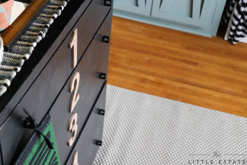
 I wanted it to be a place that brims with learning opportunities, around every corner (or drawer!) in the form of numbers, letters and shapes.
I wanted his bedroom to be a space that is pulled together in tone and style but one that is not too precious to be pulled apart too.
 A space that could house fun in the day and one that could also be a comforting solace at the end of the day. A bedroom that would encourage calm and quiet after the effects of a busy stimuli filled day.
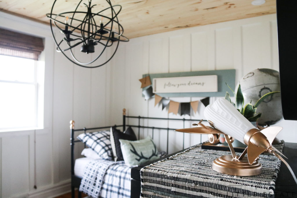
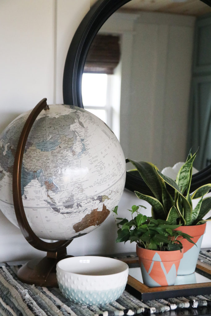 So, we did just that! We coated his space in a calming colour palette around every turn and added natural leafy elements that lend a tranquil vibe.
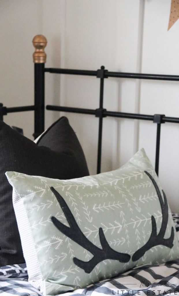
For good measure, we added as many cozy elements to this space as we could get our hands on. This sweet locally hand made faux antler pillow was undoubtedly meant for this space because of its sweet moss colour and its fun and current arrows and antlers that tend to to point to outdoor adventure.
The Art of Home, our favourite local shop carries these beautiful pillows, and I think I need one for every bed in the house now! (Check them out here!) I wanted to create a space that had form and function and this IKEA day bed allowed us to do just that. It has adequate space beneath it for storage and also pulls out to accommodate another mattress for sibling sleepovers.
 Someone is already breaking it in. 😉
 However, this room hasn’t always been the perfect place to relax in though. NOPE. It use to be dark due to it’s dropped ceiling and lack of lighting.
 But not anymore!
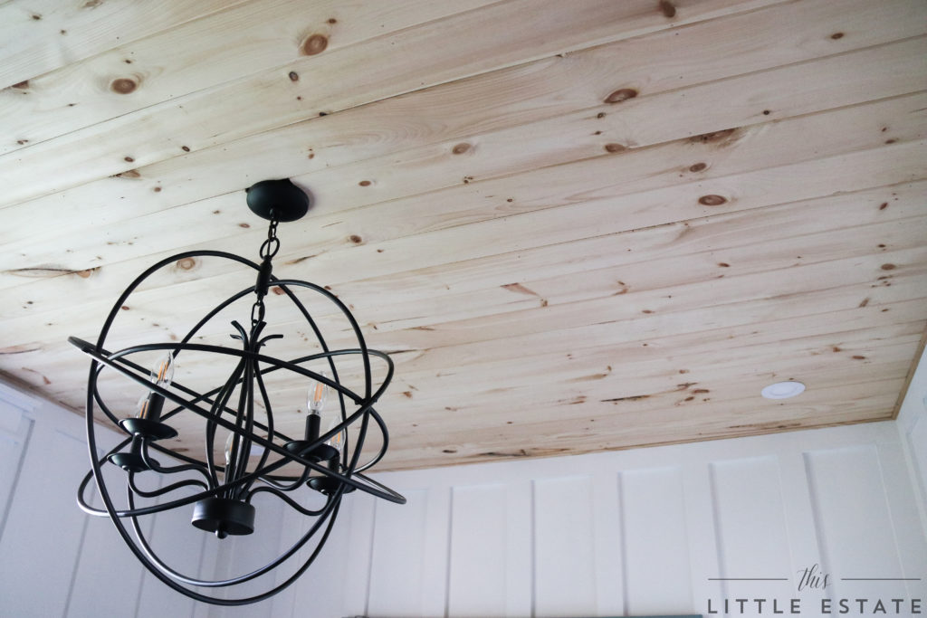 We wanted to add a vintage cottage feel to this space so we incorporated wood planks in place of the dropped ceiling. Hallelujah!!! The METRIE pine tongue and groove boards that we used, add warmth and texture to our new clean lined space.
We added a pretty round orb chandelier to break up all of the hardscape lines and a handful of recessed lighting, but mostly because these are ceilings I want to stare at day in and day out! We have come a long way in the last couple of weeks! Can you remember what this space looked like mid renovation? From dark and dreary…
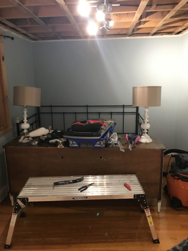 …to light and bright!
 The details of the new ceiling made such a difference to the space that we knew adding floor to ceiling board and batten panels would have the same architecturally pleasing effect!
DONT WORRY! We created a tutorial for you to follow suit if this room inspires you! 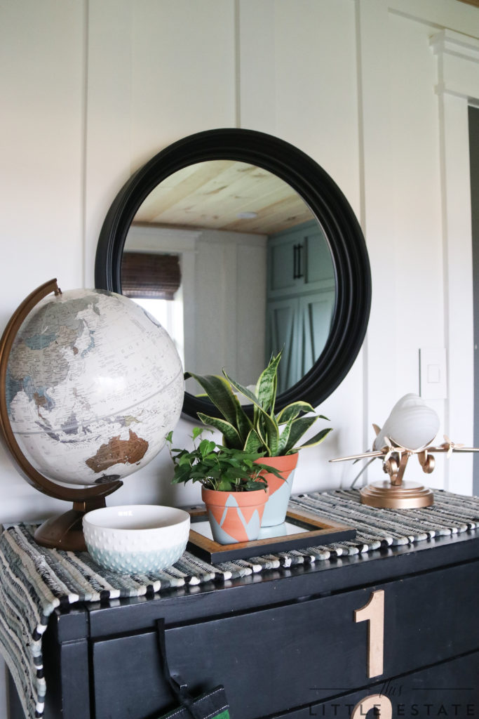 You can find the EASY and CONCISE DIY tutorial HERE:
HOW TO DIY FLOOR TO CEILING BOARD AND BATTEN
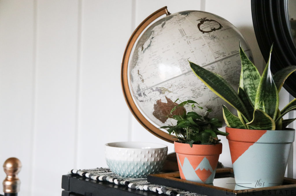 We believe that architectural elements in any space are crucial in setting the style of a room. We also thoroughly believe it is possible to make unique room elements work for you NOT against you. With some ingenuity and creativity we know all too well how amazing it can be to rethink a current design detail that doesn’t make sense and turn it into a design feature that makes so much sense!
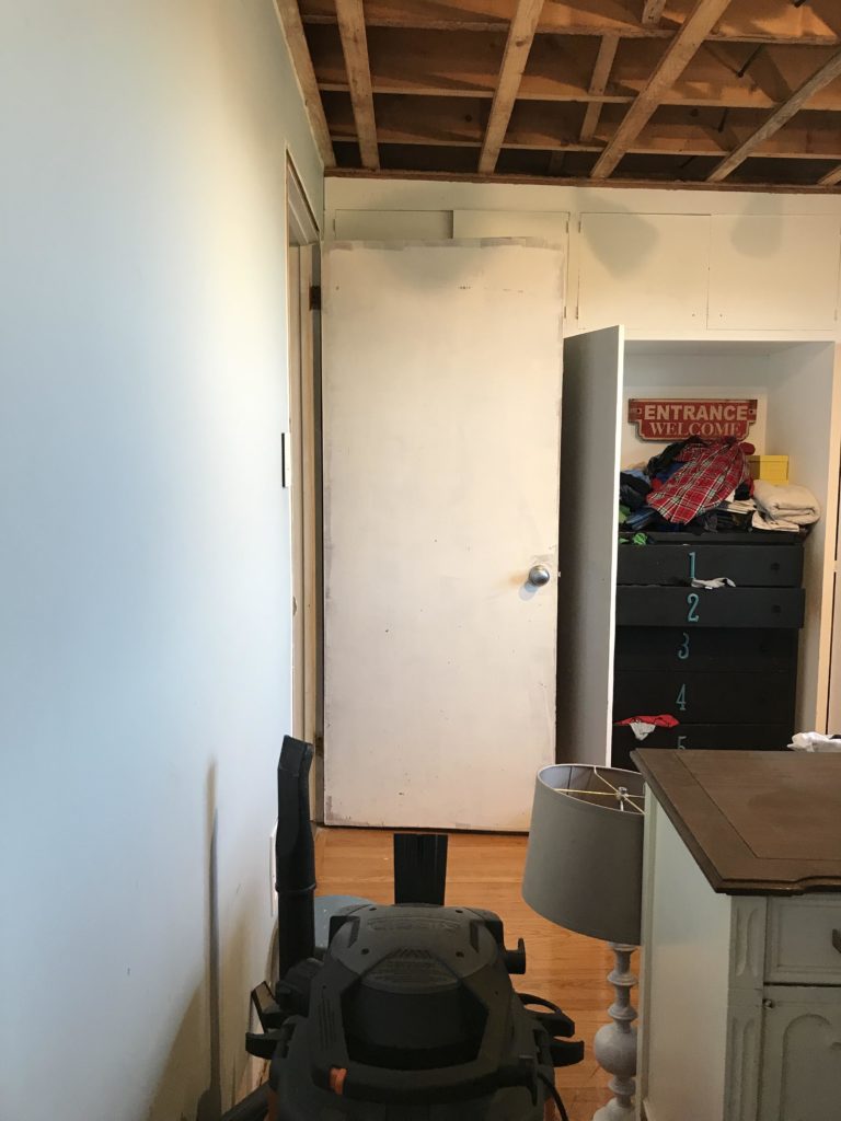
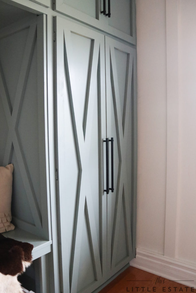 Take our original 1950’s built ins as a prime example! When we started this project they were boring and barren. Here’s proof:
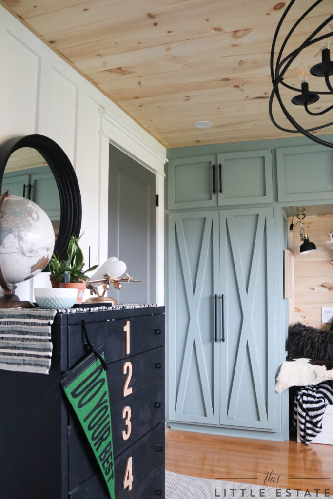 And now, they are all dressed up with METRIE pine and painted fresh! They look completely transformed, don’t you think?
We made these plain faced cabinets make sense for our space. We didn’t stop there though!
SEE MORE OF METRIE’S PRODUCTS FOR YOUR SPACES.
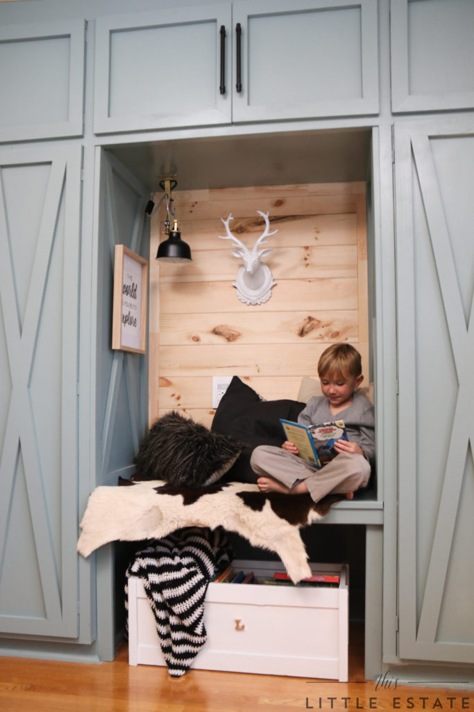
 We rethought the blank space between our son’s closets and created a custom little book nook for him! It’s hard to believe that we were dealing with THIS chaos a few short weeks ago.
 Here you can see that we repurposed the vacant area and built it into a feature location within the room.
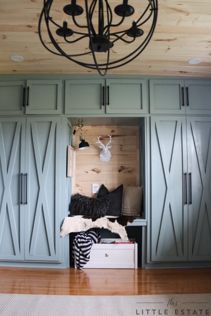 We could have seen these previously outdated cupboards as an excuse to tear them out and start with something new in their place, but we spotted potential. Did you see it too? With my hubby Art, as the lead carpenter on this millwork project, it was no time before he implemented my design and transformed this little corner.
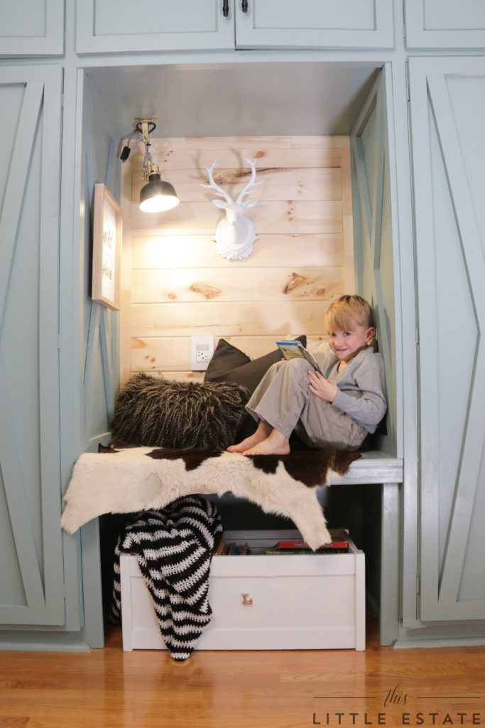 Although this area is small, we knew it needed to make a big impact to our wall of closets. We also wanted it to feel like it was meant to be there all along instead of initially being a design dilemma.
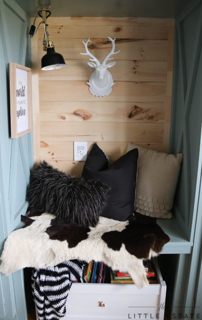 To keep the small space feeling bright, we chose to run some more METRIE T&G pine down and on to the vacant wall. We installed width wise to visually widen the space and to keep with the same direction of the ceiling boards. Not only would this maintain the flow of the space but it also allowed us to repeat that pretty textured and natural element again within the room. Yes, please!
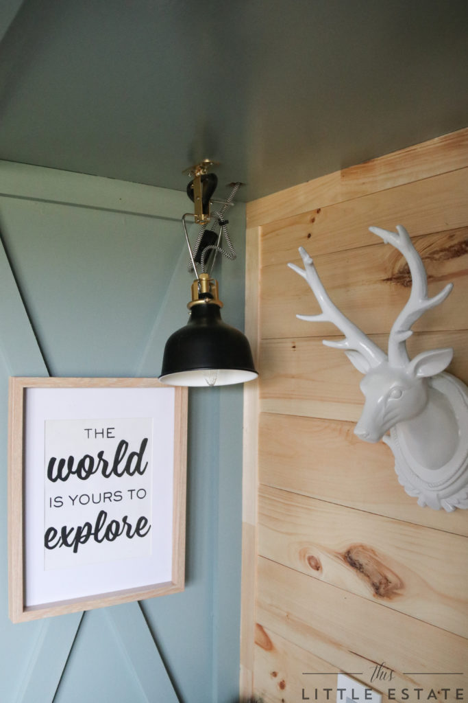 For easy reading we wired in a small light within the book nook and then layered in some cozy items for a complete look. The goal was to entice a little one to curl up in the little book nook, and I for one, can’t wait for my turn.
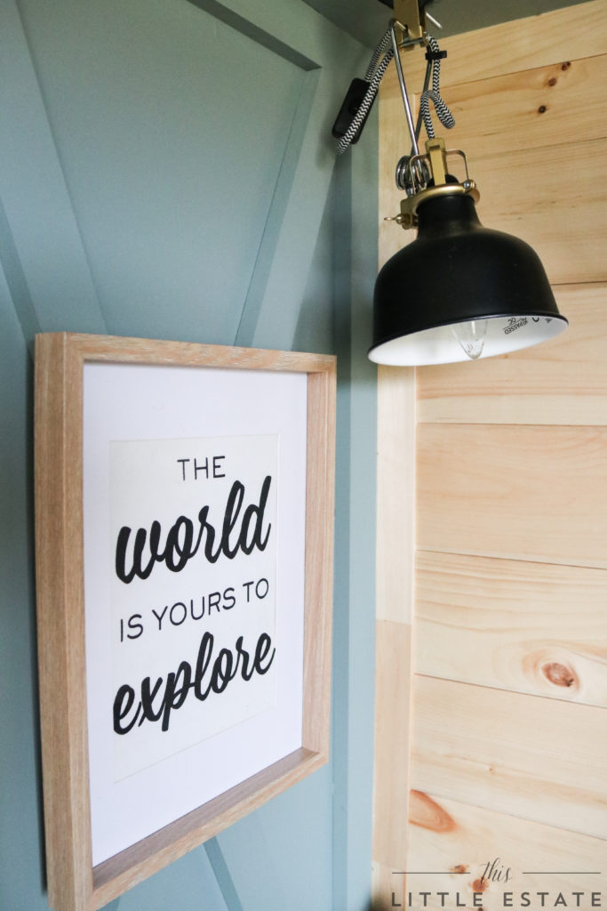 Like any made over space, I love to include new elements like paint and trim and lighting, but I also like to take advantage of the things we already have on hand. Repurposing things is my jam and I got my hands on a few items within this space and added new life to them. In fact, there are EIGHT items within this room that fell prey to my creativity.
Any guesses on what those repurposed items could be?? I’ll share the details on those DIY crafts soon. For now, this corner is calling to me and I don’t like to ignore a plea for good old fashioned quality down time. 😉
 Especially if there is a book involved.
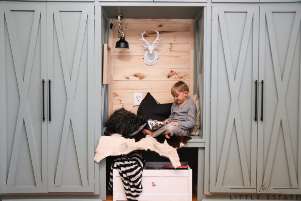 And ESPECIALLY if there is a cuddly companion too. 🙂
What do you guys think of our finished ONE ROOM CHALLENGE space? Can you believe we made it? Truthfully, I can barely believe it! Would you ever renovate a space with your spouse in 6 weeks? We hope, as we always do, that our renovations and hand built home inspire you to try new things within your spaces.
Want to see more spaces that have us inspired??
CHECK OUT OUR FRIEND’S ONE ROOM CHALLENGE REVEAL WEEK HERE!
Thanks for hosting another fun and fab One Room Challenge Linda from Calling it Home!


Dannyelle
November 16, 2017 at 2:46 amWow! It looks amazing. I love it. The outdoorsy vibe, the beautiful colour palette and all the fun little details. You guys out did yourselves.
Dianne Gingrich
November 16, 2017 at 3:49 amWow, that is an awesome little boys room! Love the detail on the closets.
Great job.
Laurie @ VinYet Etc.
November 16, 2017 at 12:34 pmAbsolutely beyond words!!! This room is as amazing as you guys are! <3 I LOVE the green contrasted against the wood, it's just the perfect touch! What a special room for your littlest love! PS you guys seriously need to market the vitamins you take – pure energy! xo
Laura Ingalls Gunn
November 16, 2017 at 2:29 pmWhat an amazing transformation. I adore the cozy little nook you made for your sweet boy. This has been such an inspiring round of the ORC. I really appreciated the extra week.
May you and your family have a wonderful Thanksgiving!
cassie bustamante
November 16, 2017 at 3:13 pmwhat a fantastic room! love the colors and i am in love with that cabinetry!
Deb
November 16, 2017 at 7:22 pmI love the character added by all the trim and the ceiling. So cozy. The nook is a great little spot for your little boy! The transformation of those cabinets is really nice!!
Denise
November 16, 2017 at 8:10 pmWOW! Love those farmhouse doors! Beautiful color too!
Leslie Biggley
November 18, 2017 at 5:51 pmBethany!!!! You killed it! Your son must be just loving that seat between the closets more than life…best room ever! Congrats on an incredible job!
Stacy G.
November 19, 2017 at 2:02 pmAdorable! Your design is classic, and it will grow beautifully with your cute little guy. Great work!
Andre
November 21, 2017 at 2:17 pmLooks so good. What a sweet room for a little guy – I’m inspired!