 It’s here, it’s here, it’s finally here! It’s reveal day for our one room challenge!
I have got to admit to you guys that the first week and this last week of the challenge have been our absolute busiest! I suppose we like to begin and end things with a bang! Or, we just work really well under pressure! Ha!

I can’t wait to show you the finished space today!
BUT FIRST, here is how it all came together this week….

The old unpainted baseboard had to go. It was stained from some water damage and didn’t really jive with our new fancy chair rail. So, I pulled it all up this week and my awesome hubby got right to installing new beautiful Metrie trim, just in the nick of time! (Like, I was literally caulking and painting the new trim late last night!;)) I am in L-O-V-E with all the beautiful interior finishings in this space now! For those of you who will ask, we ended up installing the 6 1/2 inch Victorian MDF baseboard for this space because it definitely marries beautifully with the chair rail.
OFFICIAL METRIE TRIM LINKED HERE.


We caulked all of the seams on our new chair rail boxes and JUST LAST NIGHT decided to add one more square to the ceiling as well. This took a bit of maneuvering with some help from our tools and a lot of PL glue, but its done now!

I painted the walls, and ceiling out the same colour to keep ones eye moving around the entire space. I chose a matte finish which isn’t typically used in bathrooms, for durabilities sake, but this Beauti-Tone paint with it’s soft matte finish is both parts washable and soothing on the eyes. I chose “Pink Touch” for this pretty pink powder room and I love the fact that the colour changes around the space, depending on the angle and the time of day.
In a space where soft elements like draperies, carpets and such aren’t possible to visually warm a space, a matte paint finish will do that for you. Your walls will feel look like they feel like velvet!

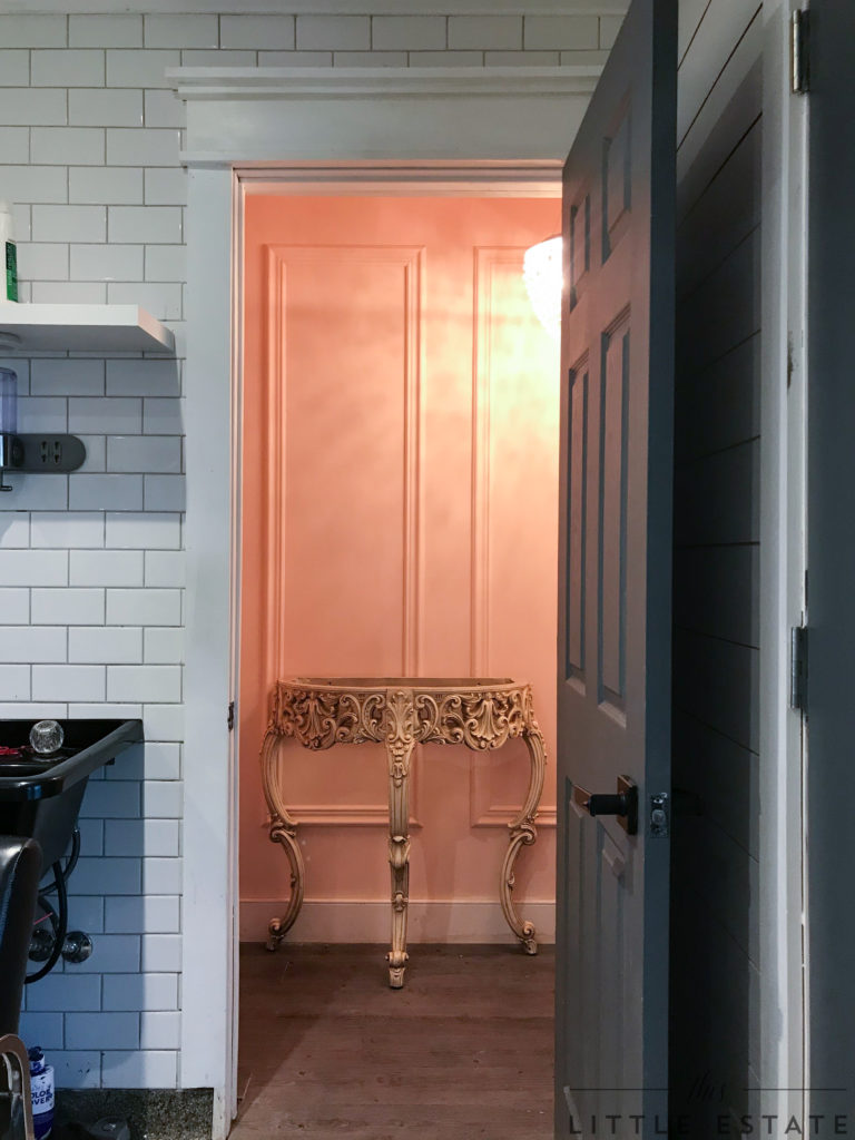
This week, I also transformed this Habitat for Humanity find into the perfect addition to this space! It was just what I was looking for and I am obsessed now with its new look.
Furniture Tutorial to COME!
Lucky for me, she was also the perfect fit in our small powder room.
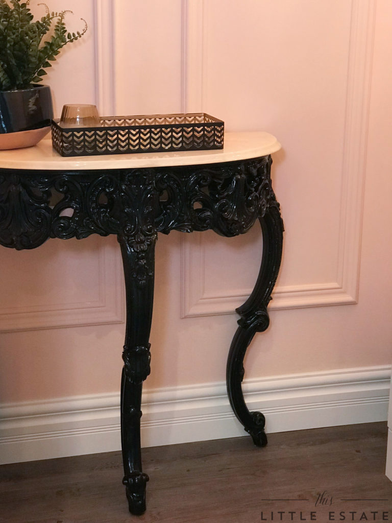
After attaching the pink swirled marble to the top of my Re-Store treasure, I styled her simply with some dark elements.

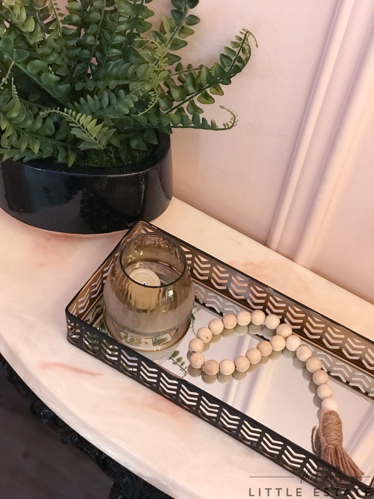


Speaking of dark elements, I switched out the chandelier, with it’s difficult to clean crystals, for a less fussy orb structure. It’s stark black design is timeless in shape and structure and it’s rose gold interior adds the perfect amount of femininity to the overall look of this piece.
(SEE ORB CHANDELIER FROM HOME HARDWARE HERE!)

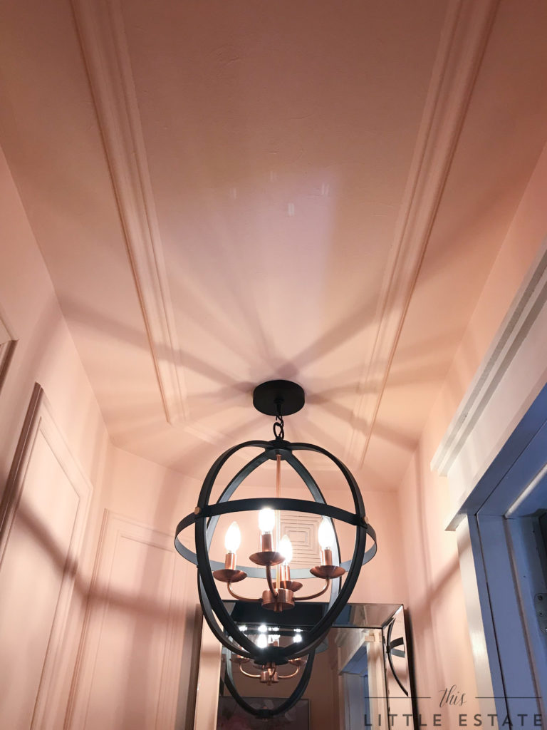
With the added chair rail on the ceiling, along with the romantic shadows of the new chandelier, the room feels so regal now.


I’m perfectly obsessed with this fixture! I was pleasantly surprised when my online order arrived and it was even prettier in real life than it looked on the computer!
YASSSSSSS!
Can you tell I love a good light fixture by all of this babies close ups? 😉


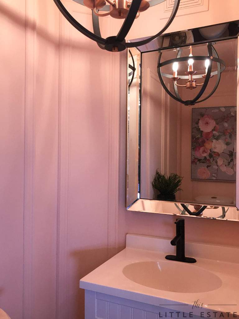
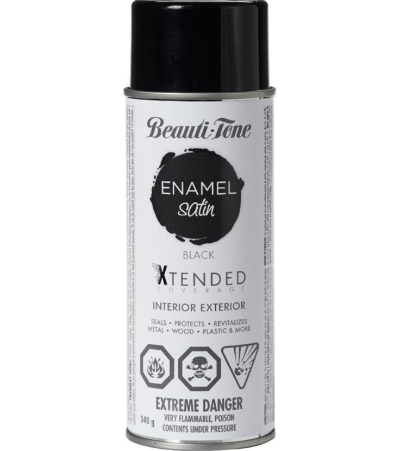
To really add some old world charm to this space, we replaced every shiny metallic accessory, like the chandelier and the faucet, and replaced them with dark options. I even spray painted the cabinets pulls dark like the table with Beauti-tone spray paint!
Because of the previous faucets design, and our rich iron well water, the faucet with the sloping design of it’s spout, allowed awful build up to become resistant to every cleaning project we tried on it. Problem solved with our new faucet!
We mused that a faucet with a straight down depositing spout would be one where looming water and build up didn’t stand a chance. So, we sourced this beauty! I love the sleek modern look of the new black faucet from Home Hardware. I was able to easily purchase it on-line and have it delivered for pick up to a store of my choosing, and so can you!
(HERE IS THE DIRECT LINK TO THE BLACK FAUCET FROM HOME HARDWARE)
Out with the old, and in with the new!


We kept the same mirror that was already here, but it now looks like it fits better with the new design. It’s new reflection is a far cry from the florals it use to show. I added in some floral art work that feels both parts modern in colour and tone and vintage in design and depth. I love how it reflects beautifully in the beveled edged mirror and how it quietly hides the imperfections from our wall debacle.
(Read last weeks post HERE to know what I am talking about!)


I absolutely love the new timeless look of this space. Because this space is attached directly to my studio, clients have already visited this space today and can’t get over how different the room FEELS! Which is exactly what I wanted to accomplish. A six week success!
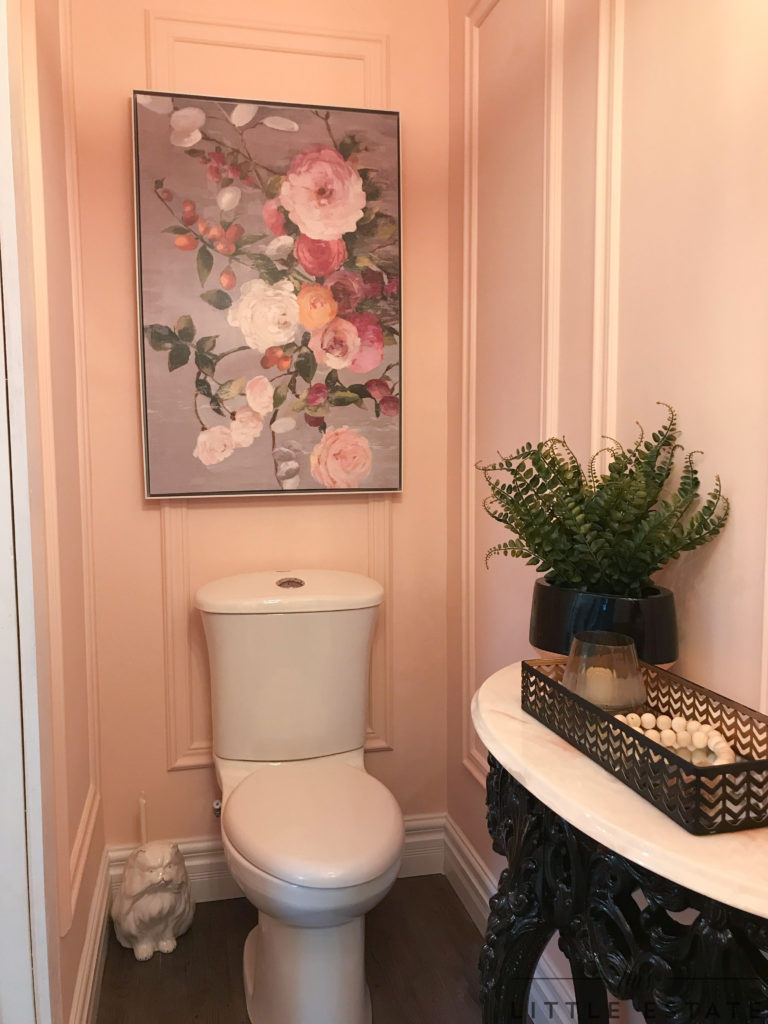
I love a good before and after, so I’ve put together a little visual walk through below, showcasing where we started with this space (or lack thereof!) and where we are today with this space after six weeks of making changes.
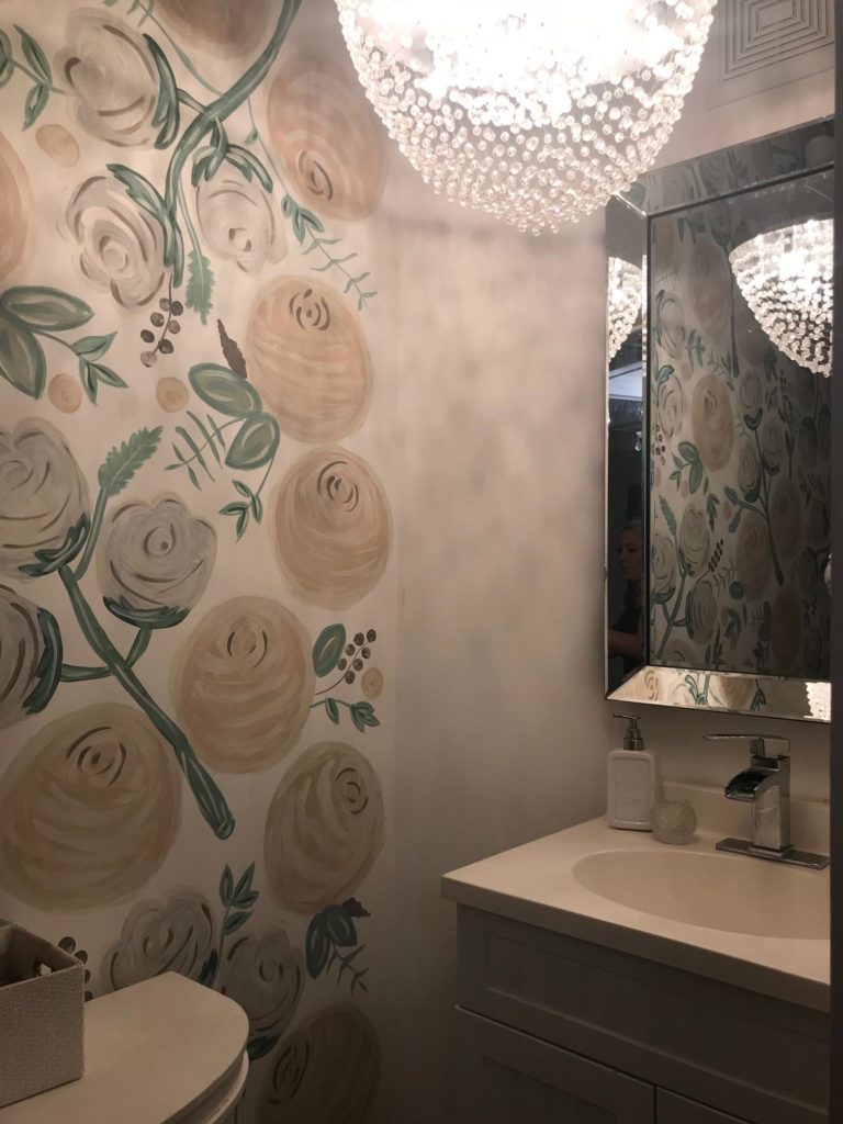
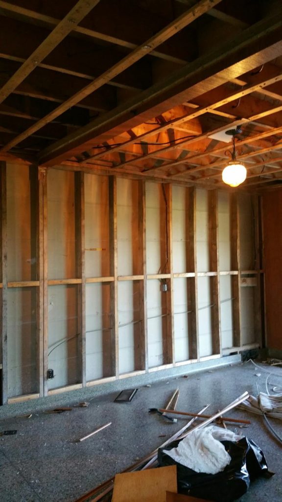
Here is where we started in early October: Barnwood installed with glue and nails? A damaging drywall and design debacle! lol


BEFORE:

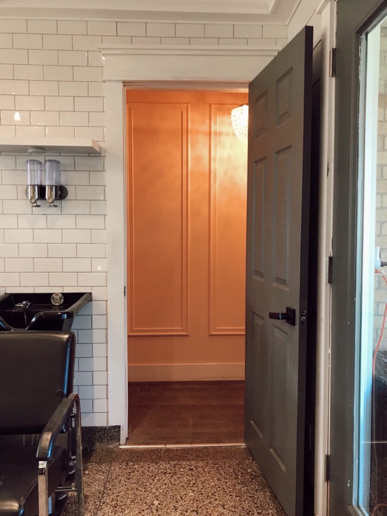
AFTER:
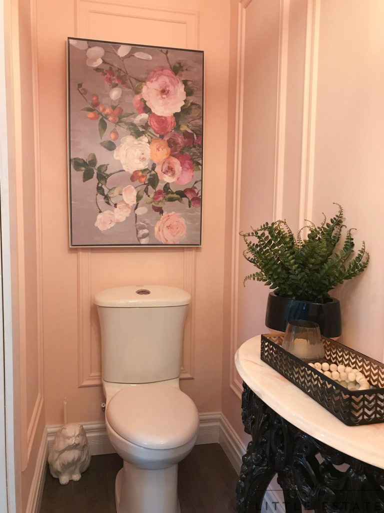
BEFORE:
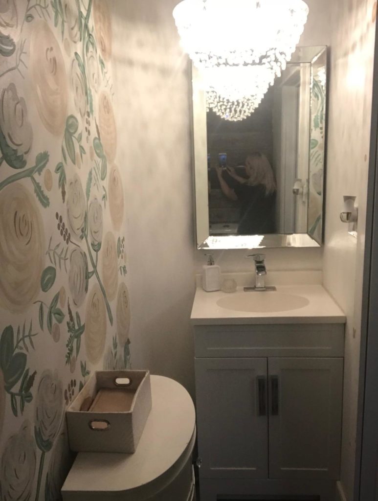
AFTER:

THREE YEARS AGO:



If you want to get caught up on the last few weeks of our renovation, you can do so by checking out these posts below. If you love design and problem solving as much as we do, we hope these posts inspire your next DIY renovation!

Thank you for following along with this challenge! Your kind comments over the last six weeks have been so encouraging and appreciated!
ALSO, a GIANT thank you goes out to our amazing sponsors who made this makeover possible! We love supporting and showcasing local Canadian companies and loved that we got the opportunity to do so again with this space.
SHOP OUR PINK POWDER ROOM NOW BY CLICKING THE IMAGES BELOW!

NOW, I cannot wait to check out all of the featured designers and their spaces as well as all of the other participants!
Click the image below to be taken right to all the design amazingness of everyone who took part in the One Room Challenge and what they created! I’ll see you there.


Have you been following a lot of the One Room Challenge participants? Any favourite room reveals? I’d love to know which spaces I need to check out first!








Veronica Solomon
November 8, 2018 at 5:30 amOMG! How amazing and super gorgeous! We both did a pink powder room with panel molding detail. Haha. Love it! Amazing job