Earlier this year, my husband Art and I set out to redo a lucky families space along side Leon’s Furniture. We gave an unsuspecting family the makeover of their dreams and just in time for the holidays!
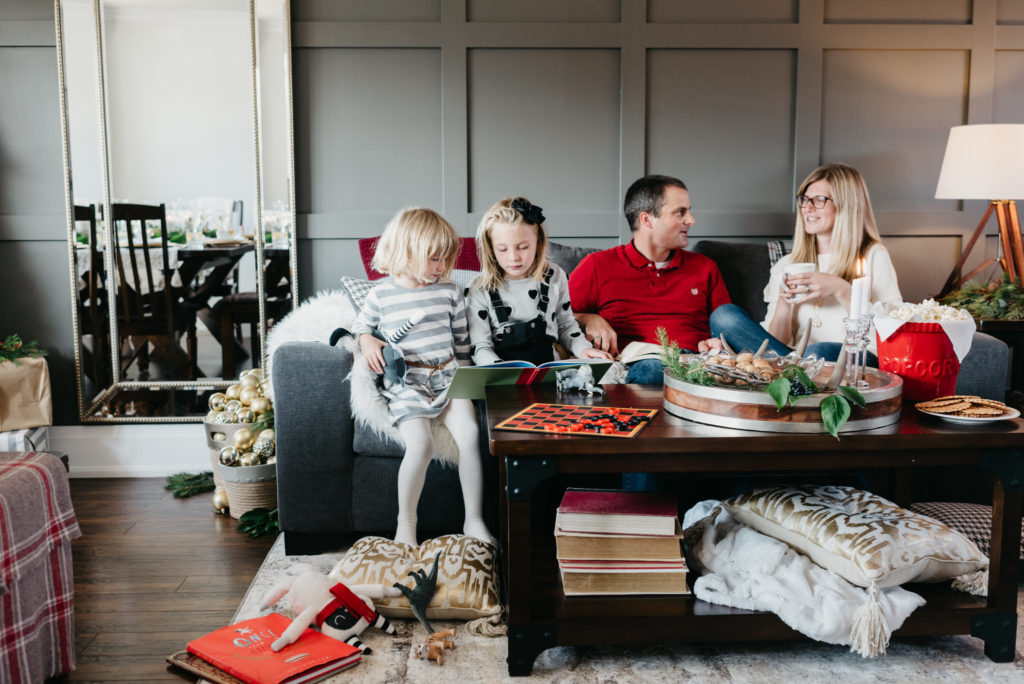
The family, we later would refer to as Glen and Dorothy Simm and their two daughters, had entered a contest that was in this past summer’s Hello Sunshine magazine and they won! Art and I set out to redo their space and give their main floor more form and function and pretty!
After they received the initial phone call confirming that they had indeed won a contest they had entered, my husband and I visited their home in Hamilton Ontario so they could see us in the flesh and know that this surprise makeover was actually happening.

When we arrived at the Simm’s home, we knew we had lucked out. Dorothy and Glenn are extremely easy going, fun and interesting people, who were excited with all of our ideas for their space. We immediately liked them and they in turn immediately liked the ideas we proposed for their living and dining room. Not only does the Simm family have a back split bungalow in common with us, but their love for learning and literature was something we, as designer and contractor could relate with. In turn, we got a good idea on how their young family uses their space. They were up for anything we wanted to do to their space, as long as we kept their book collection within arm’s reach.
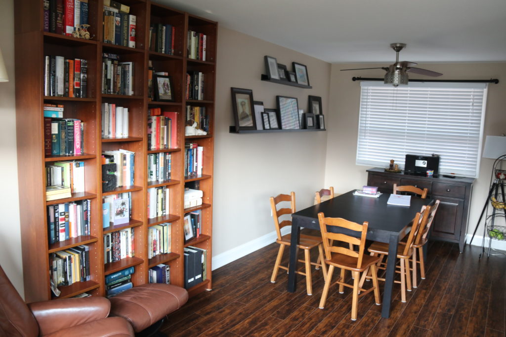
At first this seemed like an easy task, except at further and closer investigation we realized that an L-shaped room with two walls with big beautiful windows did impede the opportunity to design the room anyway we wanted. After some scratching of our heads, my husband and I presented the Simms with a design that ended up flipping their dining room and living room all together which allowed us to rethink the way they used their space.

The Simms were passionate about their book collection, and as a designer, I was passionate about giving them a gorgeous space to display them in. By flipping their living and dining room it gave us the opportunity to utilize the blank space around their window by flanking it with some much-needed bookshelves. What could have been a design dilemma in the end became a feature in this space and ultimately set the entire tone for their room.
SEE??


We wanted to create a library feel in their living room, so some custom bookshelves were the perfect addition to create a cozy and beautiful place their whole family would want to curl up in — with a book!


We will have a tutorial to come on how to create these custom bookshelves and need to say a big thank you to METRIE for providing all of the hardscape products within the space as a gift to the family who won this make over! Can you believe the difference of these before and after photos??!
LOOK!! Same angle, but different EVERYTHING!


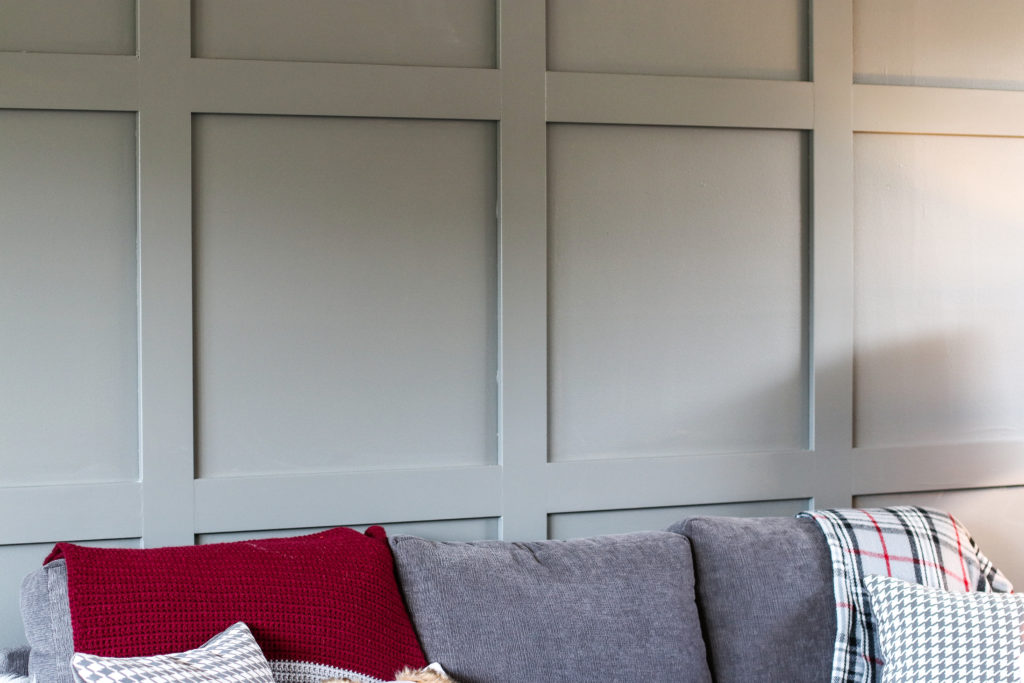
Once the Simms were on board with changing their spaces around and adding in the architectural elements like the bookshelves, we presented them with the idea to install a beautiful graphic grid pattern on their main wall with METRIE paneling to unify the dining room and living room spaces while visually expanding their space.

I made up a few room drafts and visual mood boards so that the family could have a good idea of what I had envisioned for the space and then I worked with their ideas on what Leons products would work best for their family.

COUCH/COFFEE TABLE /END TABLE/CHAIRS/LAMP/MIRROR
Then, we nailed down the style that the Simms envisioned for their space and determined that they love transitional style! This made choosing products for them so much easier. AND, I did it on line at Leons from the comfort of my couch!
Transitional Style (also known as “updated classic for men”, “classic with a contemporary twist”, “new takes on old classics”) in interior design and furniture design refers to a contemporary blend of traditional and modern styles, midway between old world traditional and the world of chrome and glass contemporary; incorporating lines that are less ornate than traditional designs, but not as severely basic as contemporary lines. As a result, transitional furniture designs are classic, timeless, and clean. -WIKIPEDIA
Because the Simms like transitional styling I also included lots of elements into their room design that had straight lines like their graphic feature wall, and the trim profile around their door ways.
(SEE METRIE MODERN FARMHOUSE FOR THESE PRODUCTS)


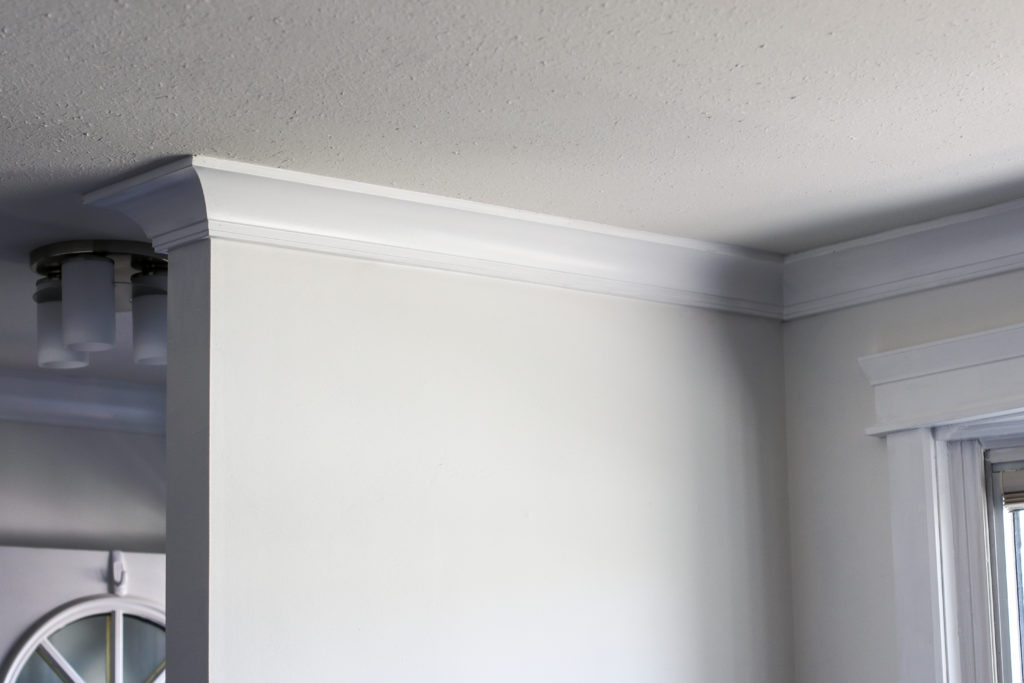
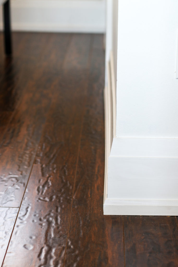
Then I layered the room with classic and timeless accessories that add texture, warmth and interest.

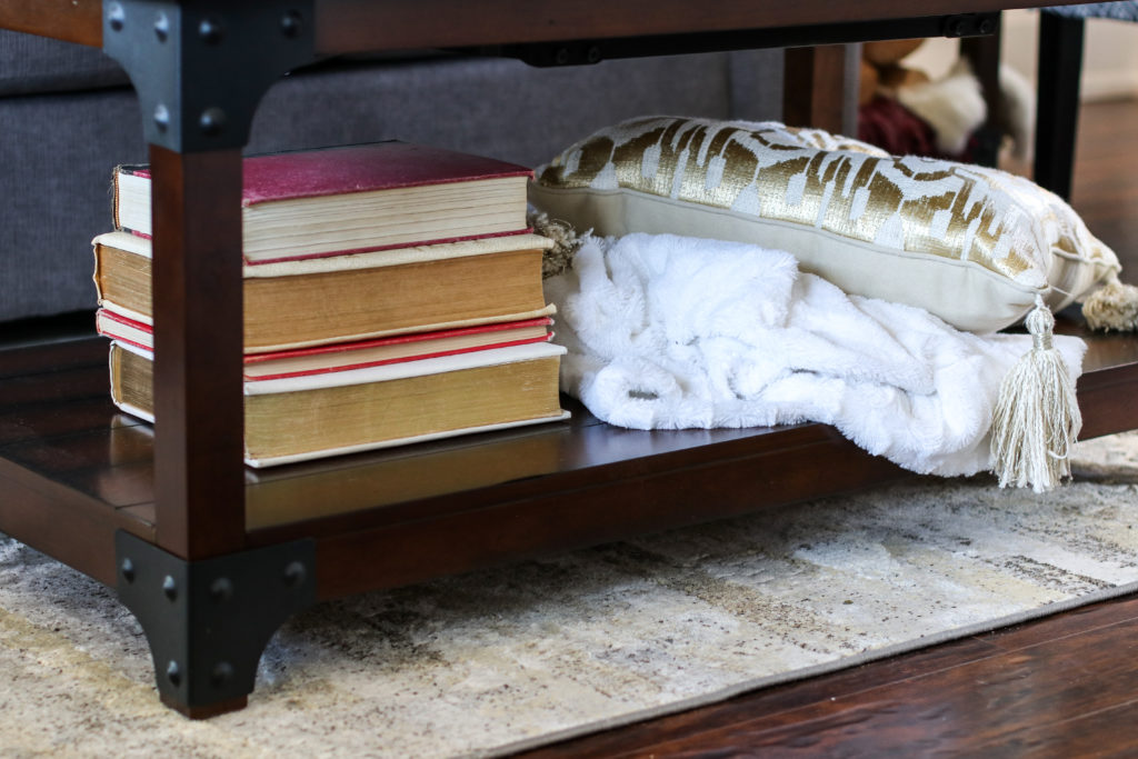
For a festive touch, I layered punches of cranberry into the space for an unexpected but welcome colourful pop.

The main floor of their home gets ample light which allowed us to use a beautiful rich dark Benjamin Moore color called ‘amhurst grey” for their focal wall. By adding a graphic pattern in architectural detail across the whole space, the room now looks expanded as ones eye is drawn back and forth around the room. This one detail also unifies the dining room and living room and makes the space feel completely cohesive while convincing us once again that interior trimmings are one of our favourite way to dress up a space!


You can check out the whole story about the Simm families makeover at the Hello Yellow blog and you can see the whole story in digital print form in this year’s Hello Holiday magazine. I promise, you don’t want to miss seeing how the Simms daughters broke in the space with their own spin on holiday festivity! Let me warn you, it was messy but no new furniture was damaged in their festive fun! 😉


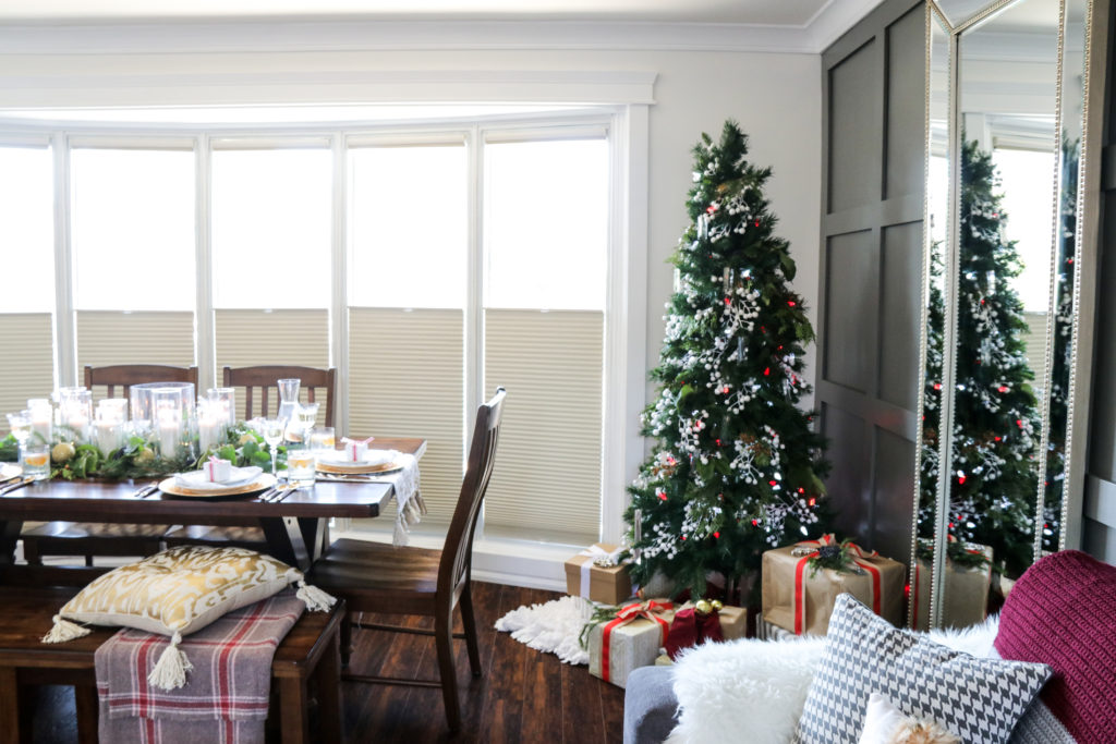
We can’t wait to show you what we did to the other side of their living space! For now, here is a little glimpse of their new dining room dressed up for a holiday feast.
(SEE MORE OF THE ROOM MAKEOVER HERE!)
